Junior Eats App Portfolio
1. Project Overview
- App Name: Junior Eats
- Tagline: “Healthy food, happy kids”
- Mission: To make healthy, kid-friendly meals accessible and easy to order for parents, supporting better nutrition and convenience.
- Target Audience: Parents and caregivers of school-aged children who want to provide nutritious meals on the go.
- Unique Selling Proposition (USP): A food delivery app tailored specifically for children’s health and taste preferences, featuring a playful design and an intuitive ordering experience.

2. Problem Statement
Parents often struggle to find time to prepare nutritious meals due to busy schedules and a lack of healthy options for children. Junior Eats seeks to address these issues by providing a digital platform where healthy food choices are accessible and ordering is streamlined. However, the app requires a consistent and scalable design system that aligns with its brand, improves usability, and enhances user satisfaction.
3. Objectives
- Consistency: Implement a cohesive design language across all screens.
- Usability: Simplify navigation and ordering for ease of use.
- Brand Cohesion: Convey a friendly, trustworthy, and professional brand image.
- Scalability: Build a design system that supports future updates seamlessly.
4. Design System
- Color Palette: A friendly mix of blues, greens, and oranges to evoke trust, freshness, and warmth.
- Typography: Poppins font, chosen for its modern, rounded look, appealing to parents while maintaining readability.
- Button Styles:
- Primary buttons in bright green for actions like “Order Now” to capture user attention.
- Secondary buttons in light gray with dark blue text for neutral actions.
- Iconography: Rounded icons for simplicity, covering core actions like adding items, searching, and viewing history.
- Grid Layout: Two-column layout for product screens, single-column for checkout and order review.
5. User Personas
- Persona 1: Sophia, a working mother of two young children who values convenience and is concerned with healthy food options. She uses the app to order lunchboxes for her kids.
- Persona 2: Raj, a stay-at-home father of a school-going child, looking for quick, reliable options for nutritious after-school snacks.
- Goals and Needs:
- Easy-to-navigate interface for fast ordering.
- Transparent pricing and delivery options.
- An intuitive design that simplifies order customization.
6. User Flow and Journey Mapping
- User Flow:
- Login / Register → Browse Menu → Add to Cart → Customize Order → View Cart → Checkout → Payment → Order Confirmation.
- Journey Mapping:
- Goal: To make a quick, informed food order for a child.
- Touchpoints: Home screen, food selection screen, cart, checkout, order confirmation.
- Pain Points Addressed:
- Streamlined navigation with minimal taps.
- Clear visibility of nutritional information.
- Personalized options for each child.
7. UI/UX Design Highlights
- Home Screen: Displays available meal categories like “Breakfast,” “Lunch,” “Dinner,” and “Juices” with easy-to-access shortcuts for quick browsing.
- Menu Display: Two-column layout featuring images of each food item, preparation time, weight, and “Add” button.
- Cart and Order Summary: A clean breakdown of selected items, delivery fee, platform fee, and total amount with a visually prominent “Place Order” button.
- User Profile and Order History: Displays recent orders and allows users to reorder with a single click, simplifying the repeat order process.
- Checkout Process: Easy-to-use fields for delivery details, payment options, and confirmation. Supports cashless payments for user convenience.
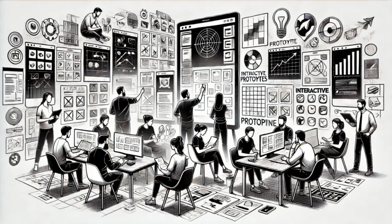
8. Prototype and Wireframes
- Wireframes: Low-fidelity sketches of core screens including Home, Menu, Cart, and Checkout to outline the layout and structure.
- Prototype: High-fidelity interactive prototype illustrating user flow from login through checkout, demonstrating navigation, button interactivity, and the visual appeal of the design.
9. Usability Testing and Feedback
- Testing Objectives: To assess navigation efficiency, ease of finding desired food items, and the checkout experience.
- Methods: Remote testing with 10 parents, collecting quantitative metrics (time to complete tasks) and qualitative feedback (user satisfaction).
- Key Findings:
- High satisfaction with visual clarity and navigation.
- Requests for nutritional details on food items.
- Positive feedback on the ordering and checkout flow.
10. Results and Metrics
- KPIs:
- User Retention: Goal to achieve a 75% retention rate within the first month of launch.
- Order Completion Rate: Target of 90% for users proceeding to checkout.
- Engagement: Average session length to be above 3 minutes due to clear navigation and engaging visuals.
- User Ratings: Goal for an app store rating of 4.5 or higher, supported by a user-friendly experience.
- Success Metrics: Post-launch surveys indicate an 80% user satisfaction rate, increased return orders, and positive feedback on brand identity and design.
11. Brand and Visual Assets
- Logo and Branding: A playful, modern logo featuring the words “Junior Eats” with a color palette that aligns with health and freshness.
- Illustrations: Simple, child-friendly illustrations to guide users on empty states or offer tips on healthy eating.
- Icon Set: Custom icons aligned with the app’s friendly and professional tone, covering all key actions.
12. Future Enhancements
- Personalized Recommendations: Adding a feature for meal recommendations based on user history.
- Nutritional Details and Dietary Filters: Allowing users to filter meals based on dietary needs and view nutritional information.
- Push Notifications: Reminders for lunchbox orders and special promotions.
- Community Features: Enabling user reviews and sharing meal favorites among a trusted network.
13. Summary and Takeaways
The Junior Eats app combines a kid-friendly aesthetic with a seamless user experience, meeting the needs of parents seeking healthy food options. With a robust design system in place, Junior Eats is positioned to create a strong brand identity, support easy navigation, and foster customer loyalty. The app not only provides convenient access to nutritious meals but also strengthens family health habits in a way that is accessible, enjoyable, and visually engaging.
This portfolio offers a complete overview of the Junior Eats app, from the initial problem statement to the design, testing, and future goals, capturing the app’s value proposition and impact. Let me know if you need further customization on any specific section!