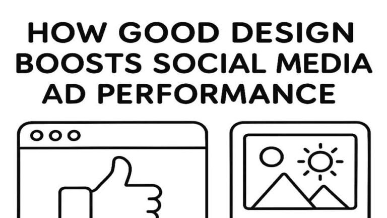
In the crowded world of social media, where every scroll brings a new post or ad, design psychology becomes a secret weapon. Understanding how color, contrast, and visual balance influence user behavior can turn a simple ad into a high-converting campaign.
1. The Power of Color in Social Advertising
Color is more than an aesthetic choice — it’s a psychological trigger.
- Red creates urgency and excitement — ideal for flash sales or call-to-action buttons.
- Blue builds trust and stability — perfect for financial or tech brands.
- Yellow grabs attention and evokes optimism — often used for lifestyle and youth-oriented brands.
The key is consistency. Align your ad’s color palette with your brand identity while considering how the target audience feels about those hues.
2. Contrast: Making the Message Pop
Contrast guides the eye — it tells users what to focus on first. A well-contrasted layout helps your CTA (call-to-action) stand out even on a busy feed.
- Use light backgrounds with bold text for clarity.
- Combine complementary colors (like blue and orange) for energy.
- Avoid clutter — your message should shine, not hide behind visual noise.
A good designer knows that balance between too much contrast (which strains the eyes) and too little (which fades the ad) makes all the difference.
3. Conversion: When Psychology Meets Performance
Great design doesn’t just look good — it performs.
When colors and contrast align with brand strategy, the conversion rate climbs. Small tweaks — like changing a CTA button from gray to red — can lead to significant performance gains.
Testing different versions (A/B testing) ensures you find the perfect mix of aesthetics and psychology that drives action.
4. The Designer’s Edge
Design psychology bridges creativity and science. It empowers designers to make decisions that not only appeal visually but also deliver measurable results.
In social ads, every pixel should have purpose — guiding emotion, trust, and action.
Conclusion
Designing for social media isn’t about decoration — it’s about direction. By applying color theory, visual hierarchy, and contrast effectively, you create ads that don’t just look beautiful — they convert.